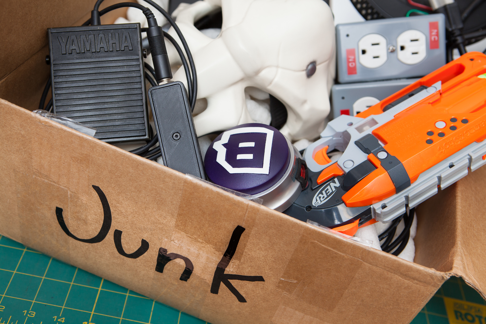
It’s been a little over two years since I started this blog to share some of the DIY projects I’ve been working on. In that time I’ve built a ton of cool stuff, including an ambilight, a Nerf gun controller for Overwatch, and a DIY stream deck. This has all been documented in-depth and shared from this blog – which by and large hasn’t changed. It’s time to remedy that and give the blog a much needed coat of paint.
I’ve been procrastinating on this for awhile. This blog is supposed to be a place to document and share my projects, not to be a project of its own. But over the past few months more than a few people have told me how dated everything looks, so it was finally time to bite the bullet and clean things up.
Out With the Old…
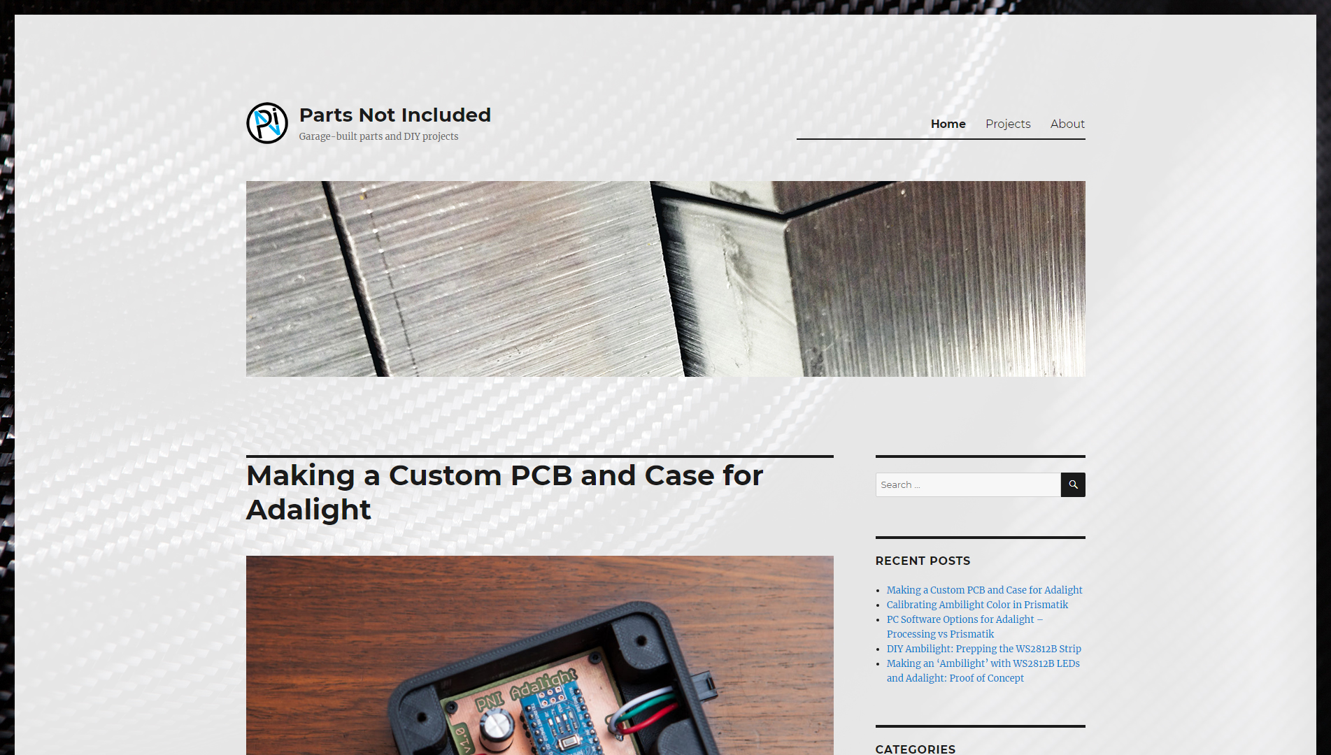
Here is the blog circa January 2017, and it’s more-or-less how it looked up until now. This is a slightly modified version of the “Twenty Sixteen” theme that comes pre-installed with WordPress. I added a few small modifications in a child theme: elongated accent bars, a custom footer, and some clever CSS to move the post meta information to the bottom of the content field. I also added a carbon fiber background with a smidge of transparency, just to make things not seem quite so empty.
This theme was never meant to be a permanent thing. I figured I would get something basic in place just to have everything up and running, and then I could always come back in a few weeks / months / years and replace it with something better. This theme was great for starting out, but it hasn’t aged particularly well.
The most common complaint was with the carbon fiber background. Initially I added it to make the monotone theme feel less empty, but some users felt that the background was too noisy and made posts hard to read on mobile devices.
…In With the New!
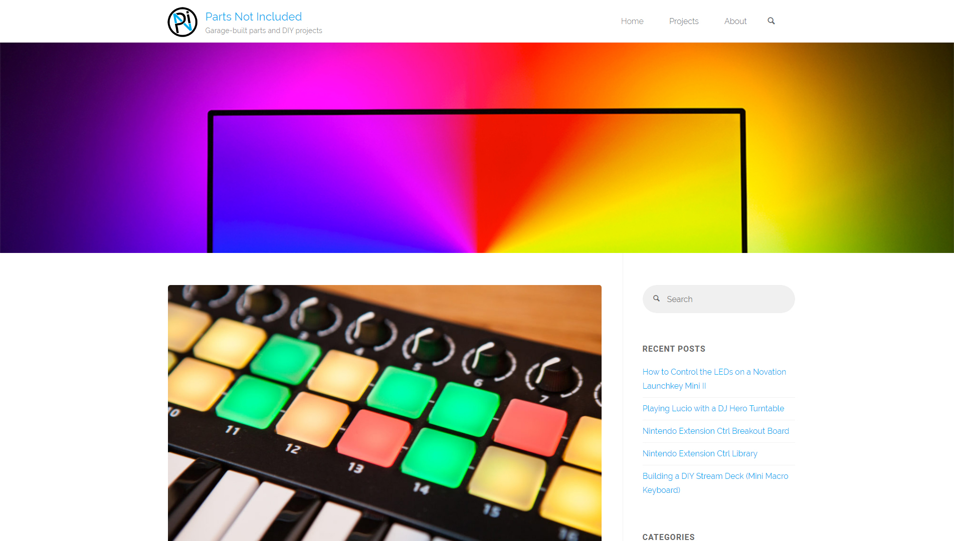
The new theme is Anima by Cryout Creations. It’s clean, it’s responsive, it’s highly customizable, and it’s free which is a big plus for me since this is just a personal blog.
Like with the old theme, I made a few minor modifications past what’s available through the customizer. Though thankfully this was less involved due to the plethora of customization options available. I did most of my testing with a local instance of the blog, so there will probably be a couple of bugs to iron out over the next few days.
All-in-all I think this is going to be a great upgrade. I really like the styling of the new theme and I think the clean look will help put more focus on the content rather than the website itself. It’s not perfect by any means, but it’s definitely a step-up.
Unfortunately I’ll have to do without the speed increase from adding carbon fiber. We’ll find some other way to compensate.
Things To Do
Although the blog looks great with a new theme in place, there are still a few things I’d like to add:
“Tutorials” category and menu itemDONE! 1/2/20Dynamic “Projects” pageDONE! 1/2/20Customized “category” page labelsDONE! I don’t remember when 🙁Custom CSS class for iframe paddingDONE! 11/5/18Fix header height scaling on mobile devicesDONE! 1/7/20Fix TinyMCE font renderingDONE! 11/24/18
Although this blog is about learning how to do things, I’ve never been a web developer and so I’ve never learned HTML, CSS, or PHP beyond the basics. I know enough to be able to tweak things here and there, but not enough to be able to make significant modifications or build a quality theme from scratch.
I’d like to become better at web development eventually, but that’s a far-off goal. In the meantime there are still plenty of other projects I’d like to tackle, so some of these may take awhile. Stick around!
