It’s been about a year and a half since I completed the last site redesign, switching from the stock WordPress “Twenty Sixteen” theme to Anima, by Cryout Creations. Anima has worked well for the time I’ve used it, but it too is starting to feel a bit dated. Rather than keep fiddling with the theme and trying to twist it into something new, I’m jumping ship entirely and switching to a new theme: Hestia.
New and Improved

Anima (left) vs Hestia (right). Both themes have been modified significantly from their default layouts.
The new theme is “Hestia“, by ThemeIsle. It’s slick, widely used (100,000+ installations), and centered around making the most out of a one-page design. And like Anima before it, the “basic” version of the theme is free to use. These two themes are very similar in style, but in the end Hestia won out with its cleaner appearance and more feature-rich landing page.
In the frontend, Hestia was developed using Bootstrap and a material kit. This looks good but it means the theme is a little trickier than usual to customize, especially since many elements (and groups of elements) use margin-left to set position with obscure class names like “col-md-10”. Thankfully elements are nested well-enough that this ends up being just a minor inconvenience.
In the backend things are wildly different. While Anima is mostly functional, Hestia is an object-oriented theme with nearly all sections of the site wrapped up in self-contained classes. The class-based nature of the theme makes things more difficult to outright override, but Hestia is also seeped in actions and filters to make the structure flexible and easy to customize.
New Landing Page

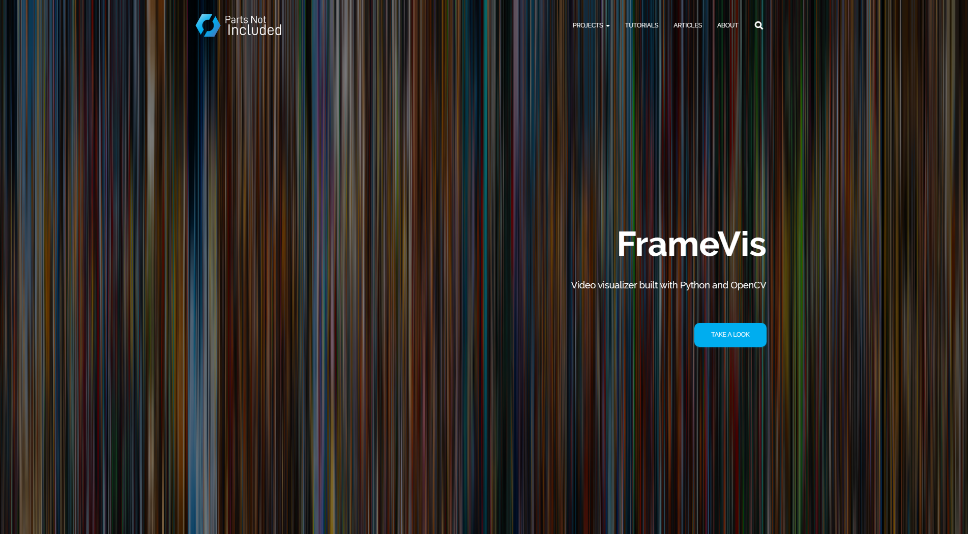
The featured project here is “FrameVis”, the video visualizer script I built last year.
With the new theme is also a brand new landing page!
Previously the home page of the site was just the typical “blog” page – the most recent taxonomy posts, shown in descending order. With the new theme this has been replaced by a “real” landing page, showing featured projects, top categories, and a social link / contact form among other features. This is a customized version of the sectional landing page built into Hestia, and I think it’s going to work great as the new front page of the site.
So Long Sidebar
 In addition to the theme change I’m also making some layout changes to the flow of the site. First on the chopping block is the sidebar, which has been a feature of the site since its inception.
Sidebars are useful for navigation and showing repeated meta content, but they take up a good 20-30% of the page’s real estate throughout its entire length. On this site, where I tend to write long and detailed technical posts, that means most of the post ends up awkwardly pushed to the left after the user has scrolled past the introduction.
Starting today the sidebar is no more. Posts are now the full width of the site container, so all of the post content will be large and centered on desktop.
Farewell Footer
Also gone are the footer widgets. Previously, the footer contained widgets for a WordPress.com email subscription (via Jetpack), a list of the most recent posts, and a “meta” section with the site RSS feeds and admin login link. These have all been removed in favor a cleaner, sleeker look focusing on the content itself.
I’d eventually like to re-add these footer widgets in some capacity, but for the time being I’m enjoying the cleaner aesthetic.
I have high hopes for this theme, particularly because of its comprehensive landing page and the plethora of customization options provided by the hooks. I’ve already made a few dozen tweaks to the theme’s style and page layout to better fit the site and I have a few smaller changes planned for the near future. Although this new theme was tested thoroughly in a local instance before I migrated the live site, expect a few small growing pains in the coming days as I work out some of the kinks.
Take a look around, let me know what you think!


